CSS animations are amazing, I often use them, but recently I learned it's a good practice to add a small delay, so they don't flicker if the user accidentally hovers it.
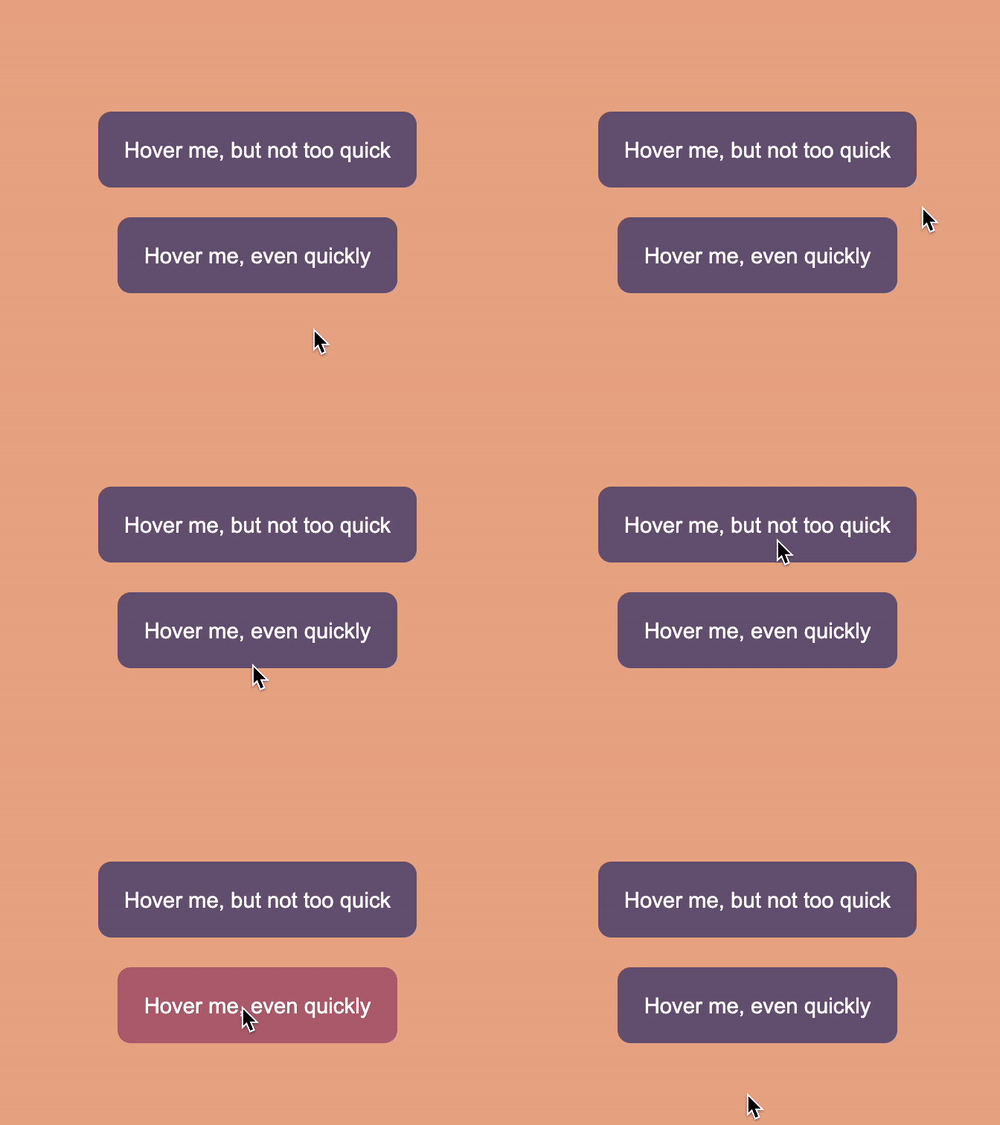
To demonstrate what I mean by that, check what's happening here:

Pretty annoying, this one isn't the worse, but it might become super annoying if you add some more transitions.
So how can we fix this?
Adding a CSS transition-delay
In general, for our above example, we use the following CSS.
button {
  background: #6d597a;
  transition: background 0.2s ease-in-out;
}
button:hover {
  background: #b56576;
}
Fair enough, right? It animates the background in 0.2 seconds from our initial color to the new color.
However, this gives us that annoying flickering effect if we hover it too quickly.
The solution is quite simple. We can add a so-called animation-delay
It comes as the 1st of the timing options:
transition: background 0.2s 0.1s ease-in-out;In my case, the second time parameter (0.1) is the delay.
It adds an animation-delay: 0.1s. This is the time our animation won't start working.

Above, you can see the fix in action. Pretty cool, right?
Try it out on this Codepen.
See the Pen Delay your CSS animation to make then cleaner by Chris Bongers (@rebelchris) on CodePen.
Thank you for reading, and let's connect!
Thank you for reading my blog. Feel free to subscribe to my email newsletter and connect on Facebook or Twitter