I've never really learned the clip-path concept, and this article is a change in that habit. I'll go through the learning process of the CSS clip-path property to make some fantastic shapes with CSS.
To give you some more background: back in my day, when we worked on CSS, a lot of the shaping was done by overlaying elements and hiding them among other shapes above it. The clip-path property existed but didn't have massive support back then.
That is, of course, changed, but my habits did not change, so let's refresh my brain 🧠 by exploring the CSS clip-path property.
Understanding basic clipping with clip-path
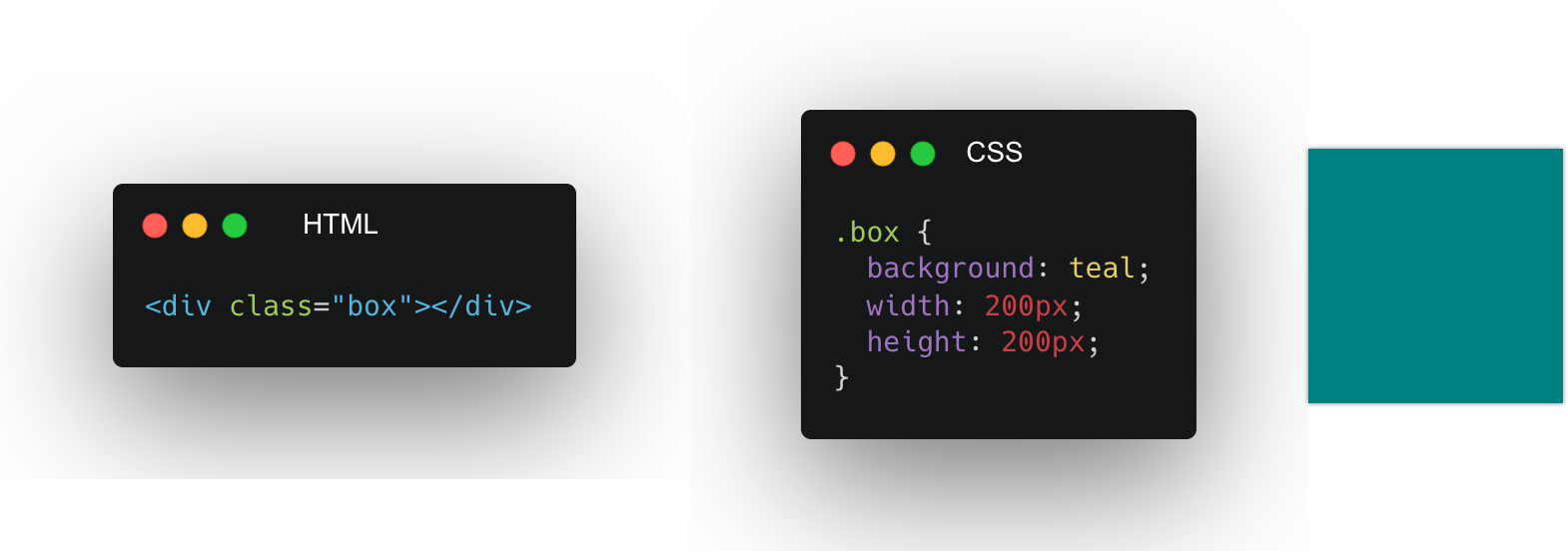
Let's first look at the central concept of clipping. We'll start by defining a sample box that is 200 by 200 pixels and has a background:

Nothing crazy yet, but let's see what happens when we add clip-path in the mix.
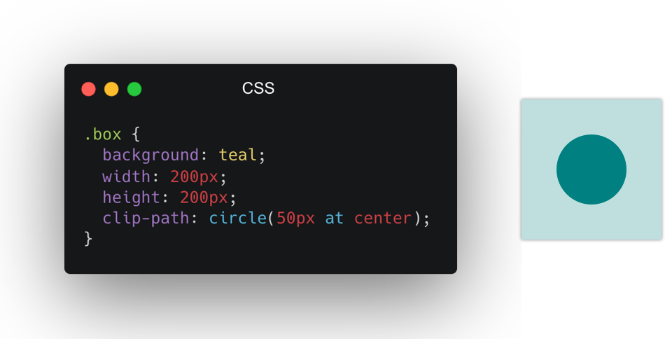
We'll put the clip-path on the box class, and we'll start by clipping a circle in the middle of our box.

I've made the clipped piece less transparent for you to see, the actual clip-path only shows the circle bit, but this should give you an idea of the clipping. It masks on top of an existing item.
The shape of your "clip-path"
There are a couple of shapes we can use as clip paths. Let's have a look at those and how they work.
Circle
The circle we have already seen in the basic example comes with the following syntax:
circle(radius at posX posY)The default position will be center, so we can also use a circle like this:
clip-path: circle(50%);This will make a circle that fills the whole box since the circle is half of the box. And place it in the center by default.
However, we can offset the circle like this:
clip-path: circle(50% at 70% 20%);Which in turn, results in this:

I've added the box as a transparent element so you can see what part is being clipped by our circle.
Ellipse
A shape that works similarly is the ellipse, which has two values for the radius.
ellipse(radiusX radiusY at posX posY)To use it to clip our box:
clip-path: ellipse(50% 25% at 50% 50%);Resulting in a shape like such:

Inset
Another great option is the inset value. This can be used to inset from the box bounding.
In basic it works like this:
inset(top right bottom left round roundX roundY)Let's try out a quite extreme issue to showcase what happens:
clip-path: inset(10px 20px 30px 40px round 15px 50px);Resulting in a shape like this:

Polygon
The last one is super versatile. It's called the polygon and accepts pairs of x/y coordinates. Making it possible to create impressive shapes with this.
The basic properties work like this:
polygon(x1 y1, x2 y2, etc)Let's make a star shape and see how that works:
clip-path: polygon(
  50% 0%,
  61% 35%,
  98% 35%,
  68% 57%,
  79% 91%,
  50% 70%,
  21% 91%,
  32% 57%,
  2% 35%,
  39% 35%
);
Resulting in a star shape like this:

SVG Paths
The last resource we can use is an SVG path. Yes, you heard that right.
Let's see how that works.
First, we'll need an HTML resource that has a SVG clip path definition:
<svg class="svg">
  <clipPath id="triangle" clipPathUnits="objectBoundingBox">
    <path d="M0.05,0.05 h1 v1"></path>
  </clipPath>
</svg>clip-path: url(#triangle);Resulting in a shape like this:

Animating clip-paths
Another cool thing we can do is animate the clip-paths.
However, we can use these to animate our clip-paths, making sure they are compatible shapes. For instance, when using a polygon, keep the same amount of points to animate with.
@keyframes move {
  0% {
    clip-path: polygon(0 0, 50% 0, 100% 0, 100% 50%, 100% 100%, 50% 100%, 0 100%, 0 50%);
  }
  50% {
    clip-path: polygon(
      50% 50%,
      50% 25%,
      50% 50%,
      75% 50%,
      50% 50%,
      50% 75%,
      50% 50%,
      25% 50%
    );
  }
  100% {
    clip-path: polygon(0 0, 50% 0, 100% 0, 100% 50%, 100% 100%, 50% 100%, 0 100%, 0 50%);
  }
}
You can try this animate and all the other described properties on this Codepen.
See the Pen by Chris Bongers (@rebelchris) on CodePen.
More resources
Thank you for reading this article. I do hope you learned something new about clip-paths in CSS.
If you are eager to read more about this, check out these fantastic resources.
Thank you for reading, and let's connect!
Thank you for reading my blog. Feel free to subscribe to my email newsletter and connect on Facebook or Twitter