Besides writing daily development tips here, I actually started with a lifestyle blog.
But because of the effort that goes into these articles I kind of put this on a side-track.
I also removed the server, just because it was getting too expensive to host static blog articles... That resulted in the website having no actual blog posts anymore. And I thought it was about time I re-build the website.
I'm going to be rebuilding the website using Eleventy and if we can no JS!
As a reference to what the side should look like:
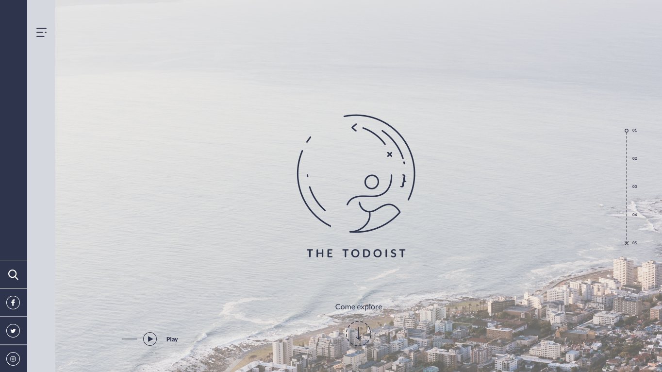
Today we will focus on trying to set up the project and recreating the project in Eleventy.
Setting up the project
We will be building this blog from scratch and not use a starter template, I even want to turn this into a stater so other people can use it.
Let's start in your favorite terminal and create a new directory in your project's directory.
mkdir thetodoist
cd thetodoist
Inside the project, we will create a new npm package.
npm initAnd install Eleventy:
npm install --save @11ty/eleventyAlso, install SASS and concurrently since we will be using those in a second:
npm install --save sass
npm install --save concurrently
Alright we should now be able to setup our project structure, open the project in Visual Studio and create the following structure:
- src - _includes - assets/css -layouts - base.njk -scss - global.scss - index.njk
- .eleventy.js
The files can be empty for now, let's first make some modifications to our package.json to help us develop faster.
"scripts": {
	"sass:process": "sass src/scss/global.scss src/_includes/assets/css/global.css --style=compressed",
	"start": "concurrently \"npm run sass:process -- --watch\" \"npm run serve\"",
	"serve": "npx eleventy --serve"
},
Here we added the sass:process to move our SCSS file to the global assets folder.
We also added a concurrently task to keep serving our SCSS changes
You can then start the project with:
npm startWe also want to make sure our eleventy file is configured correctly so let's add the right paths to that: (.eleventy.js)
module.exports = function(config) {
  return {
    dir: {
      input: 'src',
      output: 'dist'
    },
    passthroughFileCopy: true
  };
};
This makes sure eleventy reads the src folder and outputs to the dist folder.
Adding our main template
Let's add our main template in the _includes/layouts/base.njk file, this will be the template we re-use throughout the application.
<!DOCTYPE html>
<html lang="en">
  <head>
    <meta charset="utf-8" />
    <meta name="viewport" content="width=device-width, initial-scale=1.0" />
    <meta http-equiv="X-UA-Compatible" content="ie=edge" />
    <style>
      {% include "assets/css/global.css" %}
    </style>
  </head>
  <body>
    <main>
      <aside>
        ASIDE
      </aside>
      <nav>
        NAV
      </nav>
      <section>
        {% block content %}{% endblock content %}
      </section>
    </main>
  </body>
</html>
This will be our basic format, you can see the aside and nav are fixed in our template since they will be visible on every page.
We then added a content section that will render our content for each page.
Let's add the content for the first page so we can try out some stuff.
Open the src/index.njk file and add the following:
{% extends 'layouts/base.njk' %}

{% block content %}
  Welcome to our page
{% endblock %}
This tells the file to extend the base layout and render Welcome to our page in the content section.
If we now run npm start we should see the following result.
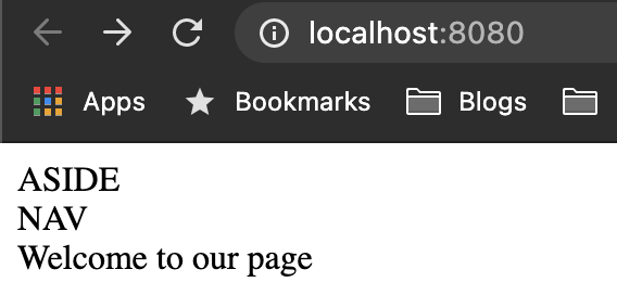
As you can see nothing exciting yet, but we are going to be working on that.
Styling the sidebar and menu
Let's first focus on bringing back the styling for the sidebar and menu.
We'll start by adding the correct HTML for the sidebar first.
Open up the _includes/layouts/base.njk file once more and change the aside to this:
<aside>
  <ul>
    <li>
      <a
        target="_blank"
        rel="noopener noreferrer"
        href="https://www.facebook.com/TheTodoistBlog/"
        ><svg></svg
      ></a>
    </li>
    <li>
      <a
        target="_blank"
        rel="noopener noreferrer"
        href="https://www.instagram.com/the_todoist/"
        ><svg></svg
      ></a>
    </li>
    <li>
      <a target="_blank" rel="noopener noreferrer" href="http://pinterest.com/thetodoist"
        ><svg></svg
      ></a>
    </li>
  </ul>
</aside>
Note: I've omitted the SVG's you can get those from the repository
Now we need to start working on our SCSS file.
Let's remove the default behavior first:
* {
  margin: 0;
  padding: 0;
  box-sizing: border-box;
}
This will make sure all margins and paddings are removed.
Then we need to define some basic variables we will be using:
:root {
  --white: #fff;
  --purple: #2d334d;
  --light-blue: #d5d8e0;
  --side-width: 58px;
}
The first element we need to adjust is the <main> wrapper this holds everything, it will need to be a relative element with padding on the left side for the aside and nav element.
main {
  position: relative;
  min-height: 100vh;
  padding-left: (calc(2 * var(--side-width)));
}
You see we use the calc method to make the padding-left twice the side of the side element widths. (Since we are using two elements there).
Now let's move on to the aside.
aside {
  width: var(--side-width);
  background: var(--purple);
  min-height: 100vh;
  position: fixed;
  left: 0;
  display: flex;
  justify-content: center;
  align-items: flex-end;
  z-index: 2;
}
The width is the side-width variable (58px) and we make this element fixed on the left side. We also add a flex option and align the items to the end (bottom).
Inside the aside we are using a <ul> so let's add some basic styling to that.
aside {
  ul {
    list-style: none;
    li {
      width: var(--side-width);
      height: var(--side-width);
      display: flex;
      justify-content: center;
      align-items: center;
      border-top: 1px solid var(--white);
      a {
        width: 1.75rem;
        height: 1.75rem;
        display: flex;
        justify-content: center;
        align-items: center;
        border: 1px solid var(--white);
        border-radius: 50%;
        color: var(--white);
        svg {
          color: inherit;
          width: 0.625em;
        }
      }
    }
  }
}
We remove the list-style (dots) from the list and give the list items a square width/height setup.
We also add the small white line on top. Then for the links, we make those a fixed width/height with a rounded border.
All of this should result in the following:
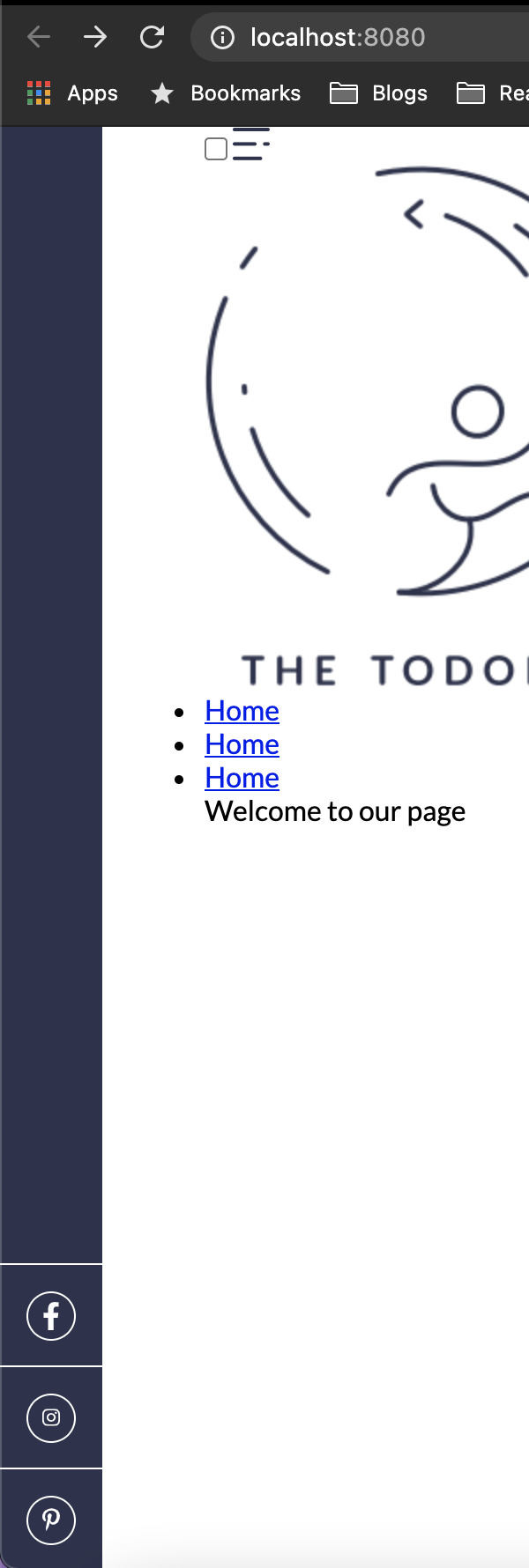
Pretty solid effort right, let's add the markup for the nav to the _includes/layouts/base.njk file.
<nav>
  <input type="checkbox" id="toggle" class="menu--checkbox" />
  <label for="toggle">
    <svg></svg>
  </label>
  <div class="menu">
    <a href="/" class="menu--logo">
      <img src="https://thetodoist.com/static/media/logo.778cffe4.png" />
    </a>
    <ul>
      <li><a href="#">Home</a></li>
      <li><a href="#">Home</a></li>
      <li><a href="#">Home</a></li>
    </ul>
  </div>
</nav>
You might have spotted we are going to use the checkbox to toggle the sidebar open and closed, the previous website used JavaScript, but we actually are better off using this CSS method.
On to the styling, let's start by wrapping the main nav element to be offset from the left:
nav {
  width: var(--side-width);
  background: var(--light-blue);
  min-height: 100vh;
  position: fixed;
  left: var(--side-width);
}
As you can see this element is also the width of size-width but offset the same with from the left, so it won't overlap the aside element.
Inside we have the .menu div which is the open state menu.
nav {
  .menu {
    width: 170px;
    height: 100vh;
    background: inherit;
    position: absolute;
    top: 0;
    left: -170px;
    z-index: 1;
    transition: all 0.5s ease;
    overflow: hidden;
    &--logo {
      margin-top: 6rem;
      display: flex;
      justify-content: center;
      img {
        width: 85px;
      }
    }
    ul {
      margin-top: 2.5rem;
      li {
        padding: 0 25px 25px;
        color: var(--purple);
        a {
          color: inherit;
          text-decoration: none;
        }
      }
    }
  }
}
The menu is always going to be 170px wide, you see initially we hide it, by setting the negative left position.
We also add a transition to make it animate once it's going to show.
Inside we add some styling for the logo and the list, nothing fancy going on there.
Now on to the checkbox!
nav {
  label {
    width: var(--side-width);
    height: var(--side-width);
    display: flex;
    justify-content: center;
    align-items: center;
    position: absolute;
    z-index: 3;
  }
  .menu--checkbox {
    display: none;
    &:checked {
      ~ .menu {
        left: 0;
      }
    }
  }
}
We make the label square and center the SVG inside of it.
We also hide the checkbox by adding display: none and add the code once it's checked.
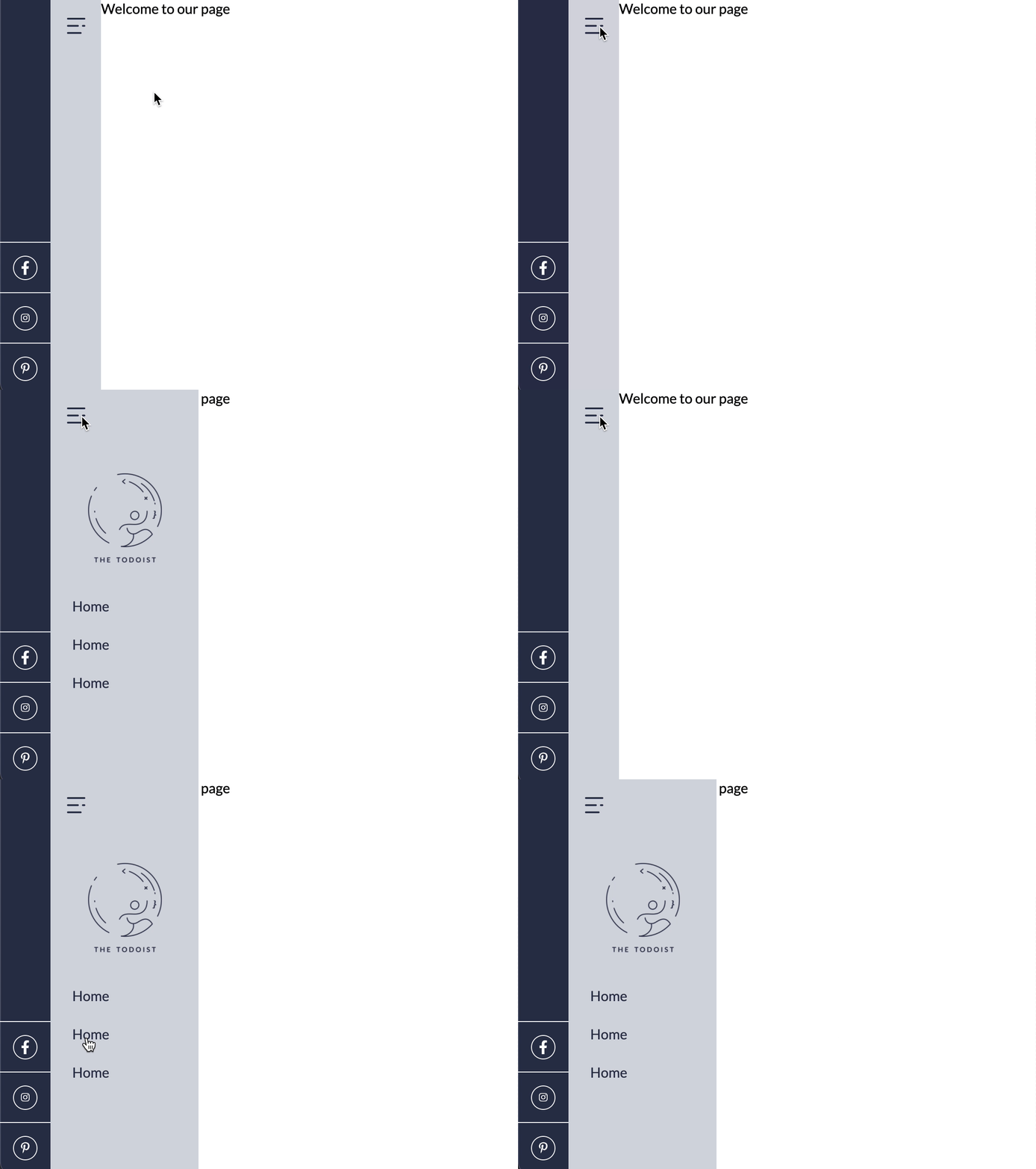
If this checkbox now get's checked the .menu div will transform the -170px to 0px making it appear for the user.
You can read more about this technique in my article creating a day/night CSS toggle.
The end result for today is the following:
If you want to build this website together with me, you can find today's GitHub project here.
Note: I will be creating separate branches for each part so you can always come back to a specific version.
Thank you for reading, and let's connect!
Thank you for reading my blog. Feel free to subscribe to my email newsletter and connect on Facebook or Twitter
