I wrote an article on creating your modal instead of using a plugin.
I reposted it the other day on Twitter, and Jhey made a good comment that it could quickly be done with the dialog element these days.
I made a Astro version powered by dialog but haven't written down the plain version for you all. So in this article, we'll create a modal with the dialog element.
The dialog element
The main element we'll be working with today is the dialog element. This is an HTML element that, by default, is a dialog (not a modal).
It can take an open state, indicating whether it's open or not.
<dialog open>
  <p>Hello from the dialog</p>
</dialog>
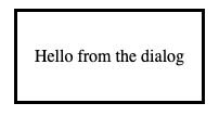
The code above will render the dialog directly on our page like this.

You'll notice that it's not a modal and doesn't have a backdrop this way.
Dynamically opening the modal
We usually want to open the dialog with some action.
Luckily for us, the dialog comes with a JavaScript API. If you give your dialogs a specific ID, we can target them.
<dialog id="mydialog">
  <p>Hello I only show on click</p>
</dialog>
We can then use JavaScript to open up the modal like this.
window.mydialog.show();However, I'd recommend using the more explicit showModal function.
This one makes it a modal, allowing us to have a backdrop and centering the dialog on the page.
window.mydialog.showModal();It's, of course, pretty rare to show a dialog directly in the browser so let's only show it on button click.
<button onclick="window.mydialog.showModal();">show modal</button>

<dialog id="mydialog">
  <p>Hello I only show on click</p>
</dialog>
Closing the modal
There are two ways of closing the modal. The first one is to use the close function on the dialog like so:
<button onclick='window.mydialog.close();'>close modal</button>Alternatively, you can use an HTML way of closing the dialog. You can put a form with the method dialog inside the dialog element.
<form method="dialog">
  <button>Close</button>
</form>
Styling the modal backdrop
The last part of why the dialog is cool is that you can style some custom elements.
We get a new pseudo-element called ::backdrop to style the backdrop the modal has.
dialog::backdrop {
  background: rgba(255, 0, 0, 0.1);
}
We should now get a pinkish backdrop color when we open the modal.
Then, of course, you can style every element of the dialog as you see fit.
Accessibility concerns
It's good to note that to this day, there are still some accessibility concerns raised.
But from trying it out, most browsers these days also got the full support of the focus within the dialog, and it's looking to be a full-blown accessible solution.
Conclusion
The dialog element, exposed APIs, and styling options are a great way to create modals these days.
I'm sure to be trying them out on a project very soon.
If you want to play with the dialog element, I've created this CodePen for you to try out.
See the Pen Untitled by Chris Bongers (@rebelchris) on CodePen.
Thank you for reading, and let's connect!
Thank you for reading my blog. Feel free to subscribe to my email newsletter and connect on Facebook or Twitter